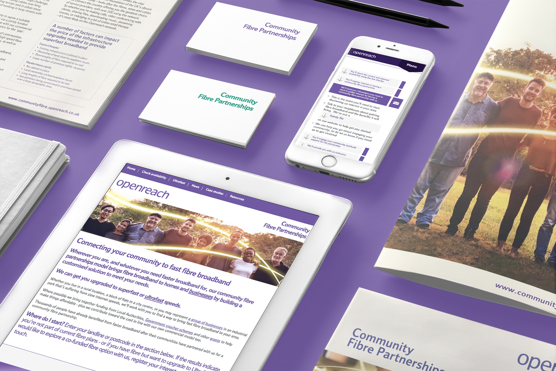
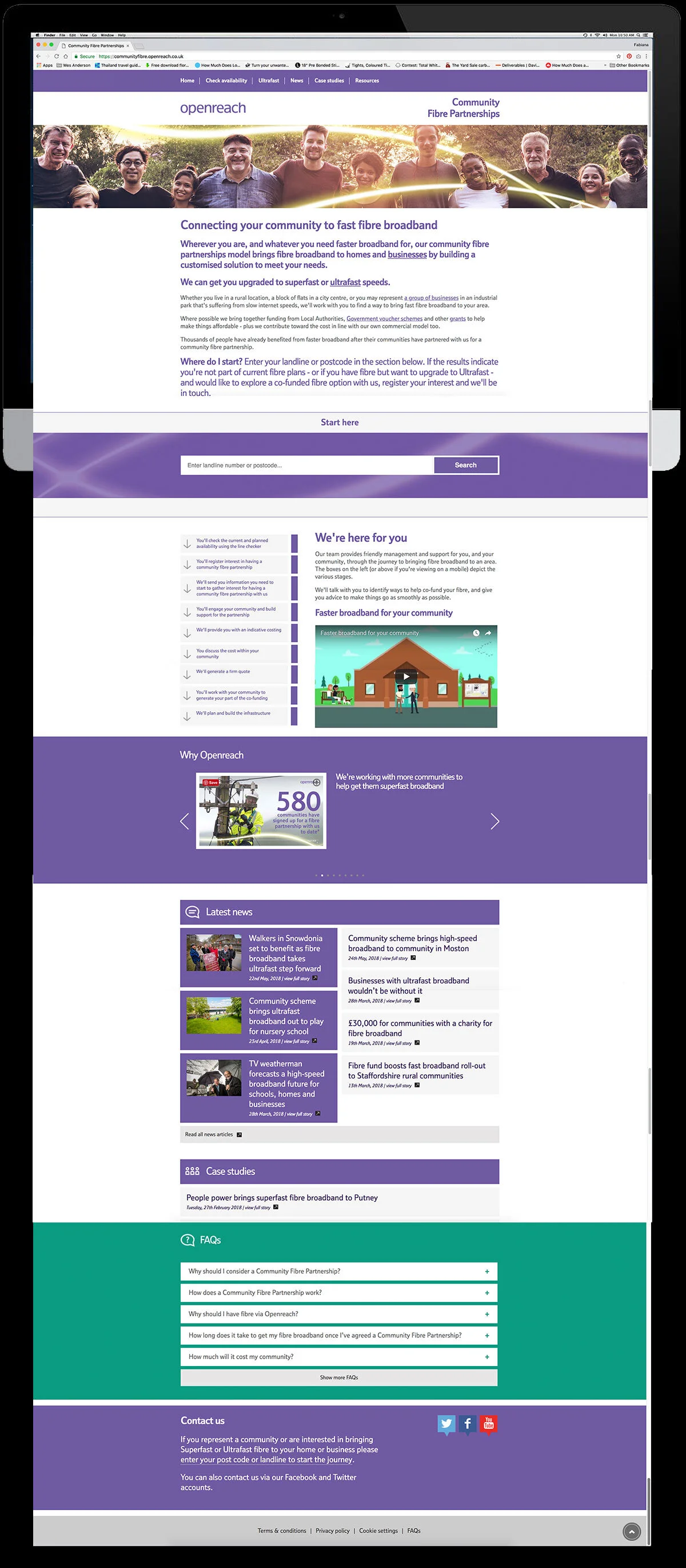
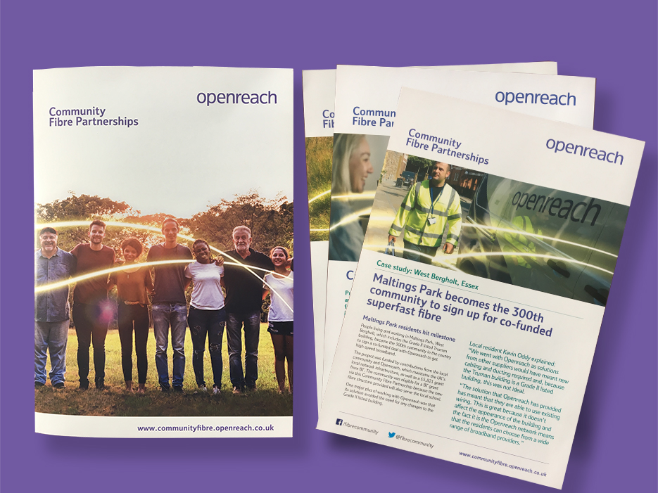
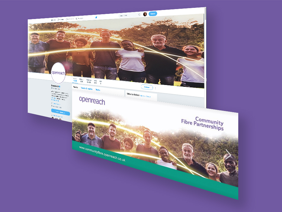
Community Fibre Partnership rebrand
In 2017, I designed the rebrand for Community Fibre Partnership, building an identity rooted in the warmth and togetherness of small English towns. The visual language centres on a dynamic swoosh of light, symbolising the fibre connection that links neighbours, villages, and regions across the UK. This motif runs through the logo, layouts, and communications, turning high‑speed broadband into a story about people staying connected to each other and the places they call home.